Round 3 - identity references

What the category owns, and what people remember

This board checks two things before any identity art is locked: which marks language apps already occupy on the home screen and in store screenshots, and what makes other consumer products recognisable without their name. The decision it feeds is on R3-Identity.

How to read the evidence Observedseen directly in US App Store art Documentedread in published case studies Inferreddesign reading, not surveyed Knownestablished category baseline
A. The home screen today: 33 language apps, by the colour of their icon

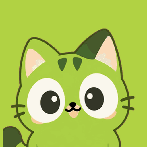
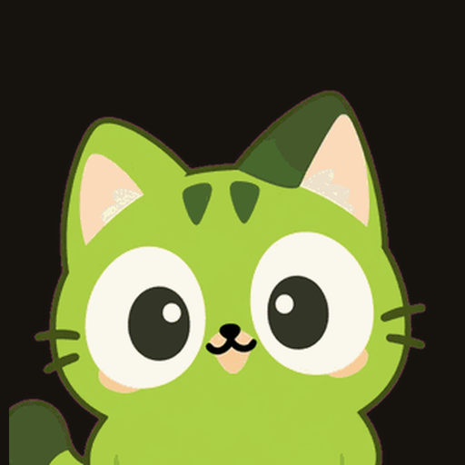
The 33 are what App Store search returned for language-learning terms, grouped by each icon's dominant saturated colour. Qoloa's two icon candidates sit where they land, ringed: the lime cat on a lime tile in the green group, and the same lime cat on an ink tile in the dark group.

Green2
DuolingoFluent ForeverQoloa lime cat on lime
Duolingo's owl is green, and Brilliant's creature is green too. A lime cat on a lime tile sits right beside the owl.
Yellow and amber6
MemriseLingoDeerRosetta StoneBeelinguappSatori ReaderLing
The busiest warm lane.
Orange and red-orange3
BabbelMondlyLingopie
No icon is true red.
Pink2
PreplyCake
Open, though off-character for Qoloa's lime cat.
Purple and indigo5
DropsHelloTalkLingvistJumpspeakPraktika
The newer AI tutors have gone purple.
Blue5
BusuuLingQAnkiQuizletLangotalk
Study tools, the default for trust.
Teal and cyan1
renshuu
Nearly empty.
White or pale7
PingoSpeakBunpoUniverbalELSATandemMango
Pingo and Speak, the two voice-first apps, both use a white tile with coloured marks.
Dark2
ClozemasterKanji StudyQoloa lime cat on ink
Two small apps use a dark tile. No large one does, so an ink tile stands out immediately.
Observed
Creatures: an owl, a deer, a bee, a monkey and a ghost across the 33. No cat. Cats are iconic in games (Neko Atsume 2 and Pusheen's Place below), so a cat is an instantly lovable silhouette that no language app owns.
Inferred
The cat's colour works; the tile around it does the separating. Keeping the cat lime and setting it on warm ink preserves Qoloa's signature green while stepping out of the green-tile lane.
B. What the content looks like inside them

Store screenshots across twelve language-app decks (five screens each: Duolingo, Pingo, Speak, Babbel, Memrise, LingoDeer, Drops, Beelinguapp, Lingopie, Clozemaster, Satori Reader, Praktika). In nearly all of them, what you read is framed as quiz tiles, chat roleplay, video clips, flags, or textbook paragraphs.

DuolingoPicture tiles and a quiz bar
DuolingoWord chips under a cartoon
PingoA chat card on blue
SpeakScenario cards with small illustrations
BabbelA stock photo, then a phrase
MemriseNative speaker video
BeelinguappFlags around a globe
Satori ReaderPlain reading text
Observed
None centers a single real attributed line from culture - anime, cinema, songs, books, or your own photos - on one tactile flippable card. Pairing real cultural lines with receding stage marks and an earned ultramarine stamp gives Qoloa a signature surface that reads cleanly in any language.
C. What people remember products by
ProductWhat it repeatsThe mechanismQoloa takesEvidence
Duolingo
One creature, one green, and the creature reacts to what you did.
The character is the product's voice, so it appears at emotional peaks and a whole system hangs off it: icon, type, sound, notifications.
The character in moments, not its green tile.
ObservedDocumented
Wordle
A small grid of coloured squares, pasted into group chats.
The result is a compact picture of what you did. Everyone's uses the same frame and personal contents, so strangers ask what it is.
A shareable stamped card: the real line you read unaided on Qoloa's white flashcard, stamped in ultramarine.
Documented
Spotify Wrapped
One poster template a year, filled with your own data.
Optimal distinctiveness: the shared look says you belong, the contents say who you are. Users do the distribution.
Where topic colour belongs: a fixed template tinted by your nine topics. Personal poster, not the logo.
Documented
Letterboxd
A calm frame, and film posters carry all the colour. The mark is three fixed dots.
Neutral chrome lets the content be colourful, while the brand mark stays fixed.
Calm white card, colourful room. Explains why nine per-user topic hues belong behind the card rather than on the app icon.
Observed
Finch
A small bird who lives in a place, in scenes that show the thing you did.
The character is shown alongside the user's real habits so it carries meaning instead of decoration.
Cat shown with the cards, peeking over the stack or cheering Day kept, without a virtual-pet economy.
ObservedDocumented
Neko Atsume, Pusheen
A cat drawn with very few features: ears, round eyes, a small body.
The character survives a 60 pixel icon and a sticker, and fans recognise the silhouette before the details.
Ears and eyes are the mark. Qoloa's face already has them.
Observed
Brilliant
Pale ground, crisp cards, pressable ink controls, a friendly green mascot.
Round 3 borrows the pressable ink button and stat tiles while avoiding the green-tile icon lane.
Buttons, tiles and calm focus, kept. Green icon tile, avoided.
Observed
Method note. The recognition test behind these questions is the distinctive-asset grid from the Ehrenberg-Bass Institute: how many category buyers link a mark to your brand (fame), and how many link it to only your brand (uniqueness). Fastest validation check: show 10 people the icon wall on R3-Identity without names and ask which icon they would tap first and whether any reminds them of another language app.